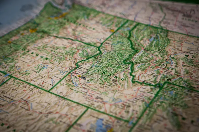
In 1912, if you wanted to plan a trip through the Colorado Rockies, you could buy a map that looked like a bird's-eye view painted by an artist who'd actually flown over every peak and valley. Mountains rose from the paper in realistic relief, rivers carved visible channels through landscapes, and forests appeared as textured green carpets draped over hillsides.
These weren't artistic interpretations — they were precise cartographic tools that showed American terrain as travelers would actually experience it. For about forty years, a small group of mapmakers produced these "relief perspective" maps that captured the country's geography with stunning visual accuracy. Then we abandoned them entirely, choosing abstract symbols and flat grids that told us nothing about what the land actually looked like.
When Maps Became Art
The golden age of relief perspective mapping roughly spanned from 1900 to 1940, driven by advances in aerial photography and a handful of cartographers who believed maps should show what places actually looked like rather than reducing them to abstract symbols.
The technique combined topographic precision with artistic rendering. Mapmakers would start with accurate elevation data, then hand-paint terrain features using careful shading and perspective to create the illusion of looking down at the landscape from an airplane — which, for most Americans at the time, was still a fantasy.
These maps were expensive and time-consuming to produce. A single map of a national park might take months to complete, with artists carefully rendering every ridge, valley, and forest. But the result was cartographic magic: maps that made you feel like you could reach out and touch the mountains.
The Mapmakers Behind the Magic
The most famous practitioner was Hal Shelton, who spent decades creating relief maps for the U.S. Geological Survey. Shelton developed techniques for using airbrush and watercolor to create incredibly realistic terrain representations. His maps of places like Yellowstone and the Grand Canyon became the standard reference for park visitors and remain stunning works of art today.
Another pioneer was Erwin Raisz, a Harvard cartographer who believed that maps should be "readable" to ordinary people, not just surveyors and engineers. Raisz's maps used perspective and artistic techniques to make complex geography immediately understandable. His 1940 map of the United States showed the entire country as a three-dimensional landscape, with the Appalachians rolling across the east and the Rockies jutting dramatically from the western plains.
These cartographers weren't just making pretty pictures — they were solving a fundamental problem with traditional mapping. Contour lines and elevation numbers might be precise, but they told most people nothing about what a landscape would actually feel like to travel through.
Why They Worked So Well
Relief perspective maps succeeded because they matched how humans naturally perceive and remember landscapes. When you drive through mountain country, you don't think in terms of elevation gradients — you remember the way peaks appeared against the sky, how valleys opened up around curves, where forests gave way to meadows.
These maps captured that experiential quality. A traveler could look at a relief map of the Sierra Nevada and immediately understand which routes would involve steep climbs, which valleys offered flat camping, where treelines would be encountered. The information was visual and intuitive rather than numerical and abstract.
Park rangers and tourism officials loved them because visitors could actually use them. Instead of puzzling over contour lines, families could point to features they wanted to see and understand how to get there. The maps became planning tools and souvenirs simultaneously.
The Shift to Abstract Mapping
By the 1950s, relief perspective mapping was already in decline. Several factors contributed to its abandonment. First, the rise of standardized cartographic symbols made maps cheaper and faster to produce. Why spend months hand-painting terrain when you could use universal symbols that cartographers worldwide would recognize?
Second, the increasing importance of precise measurement in mapping pushed the field toward technical accuracy over visual clarity. Military and scientific applications demanded maps that could provide exact coordinates and distances, not artistic impressions of landscapes.
Finally, the automobile culture that emerged after World War II changed how people used maps. Drivers needed route information more than terrain visualization. Highway maps with clear road networks became more valuable than beautiful landscape representations.
The Modern Revival
Today, a small but dedicated community of cartographers and outdoor enthusiasts is reviving relief perspective techniques. Modern technology makes the process easier — satellite imagery and digital elevation models provide the base data, and computer graphics can speed up the rendering process.
Some national parks have commissioned new relief maps using updated techniques. Trail organizations create perspective maps for hiking areas. Even some city tourism boards use relief-style maps to help visitors understand local geography.
The revival isn't just nostalgic — it's practical. As more people seek outdoor recreation, they're rediscovering the value of maps that show what places actually look like. GPS might tell you where you are, but relief maps tell you what you're looking at.
What We Lost and Found
The decline of relief perspective mapping represents a broader shift in how we relate to landscape. When we replaced visual terrain representation with abstract symbols, we lost something important: the ability to read the land itself rather than just navigating through it.
Modern relief maps are finding audiences among hikers, travelers, and anyone who wants to understand geography as a lived experience rather than a collection of coordinates. They remind us that the most useful information isn't always the most precise — sometimes the most valuable map is the one that helps you see the world as it actually appears.
In our age of GPS and satellite navigation, relief perspective maps offer something different: the chance to understand not just where you're going, but what the journey will feel like when you get there.